Product Designer passionate about improving digital products solving user real problems, always with an eye on branding.
Currently working on a new portfolio - it will be online in few days with more projects explained.

👉🏽 More about me
💼 Even more! (CV)
Ava Women
Varian - Customer Journey
Smallpdf experiments
Checkout optimization
Onboarding users
Smallpdf Visuals
Meteo Swiss
iPratico
Ava Women Visuals
Other projects
Miroverse
Medium
Meteo Swiss | UX/UI Redesign exercise
UI Redesign
(4h interview exercise)
I took one of the app that I use the most and I revamp the UI to make it more aligned with the app logo.
MY ROLE
UX/UI Designer
UX/UI Designer
TOOLS
Figma
Figma
WHEN
January 2020
January 2020
🎯 GOAL
This project was done as an exercise for an interview with the following brief: choose any app you want and design 2-3 screens on how you would creatively enhance the UI and brand and overall design.
This project was done as an exercise for an interview with the following brief: choose any app you want and design 2-3 screens on how you would creatively enhance the UI and brand and overall design.
👀 GOOD TO KNOW
I did this project in 4h more or less, as I was requested by the interviewer (which was not Meteo Swiss).
I did this project in 4h more or less, as I was requested by the interviewer (which was not Meteo Swiss).
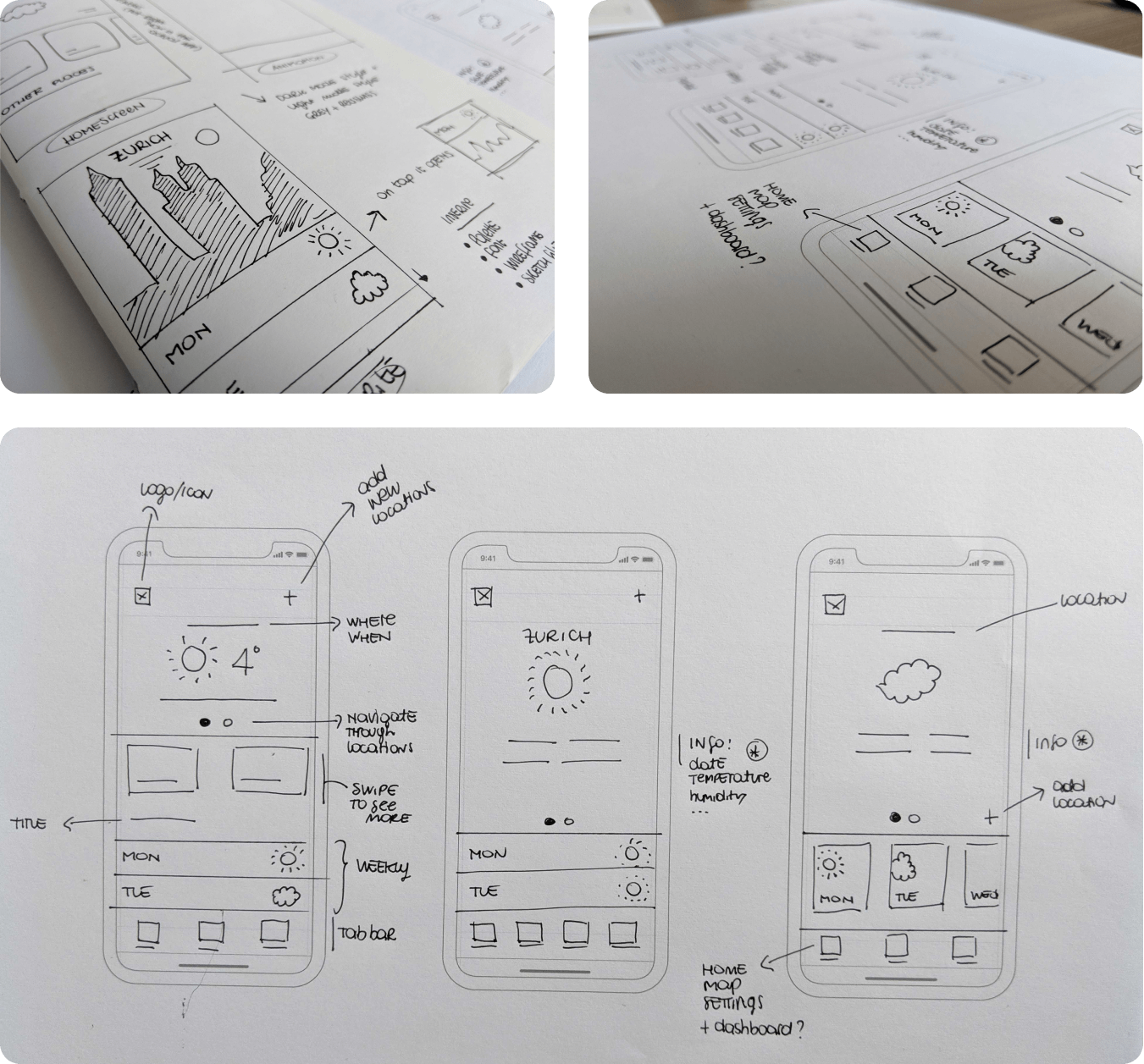
🏁 STARTING POINT
I asked 4 people, who use MeteoSwiss regularly, which parts of the app they use the most. It turns out that the most viewed sections were:
With that in mind, I started the design phase.
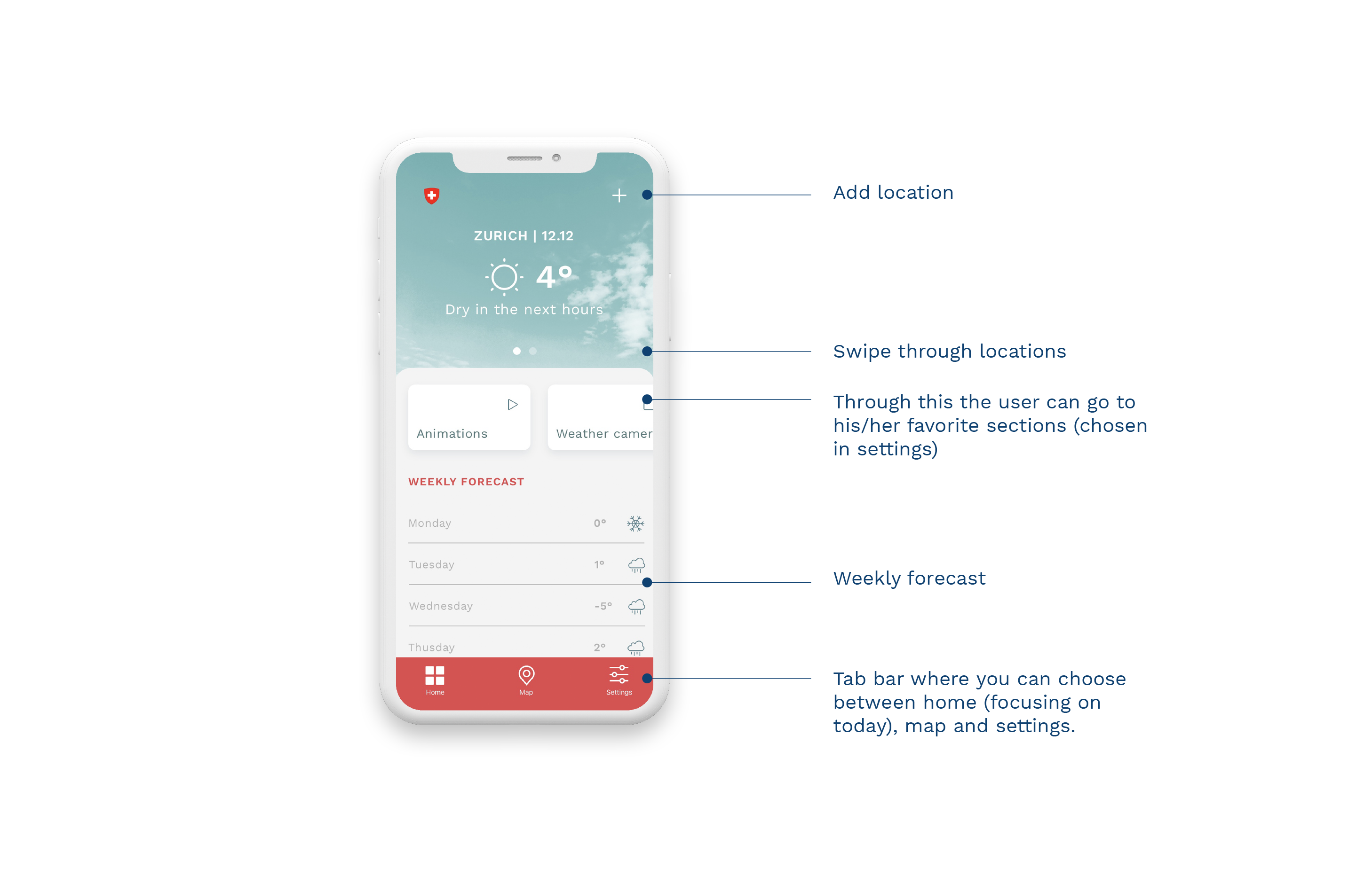
I asked 4 people, who use MeteoSwiss regularly, which parts of the app they use the most. It turns out that the most viewed sections were:
- Weather on site
- Weekly forecast
- Animations
- Weather cameras
With that in mind, I started the design phase.

👩🏻🍳 COLOR AND TYPOGRAPHY
The color palette is based on the app icon with some variations to create contrast and legibility.
![]()
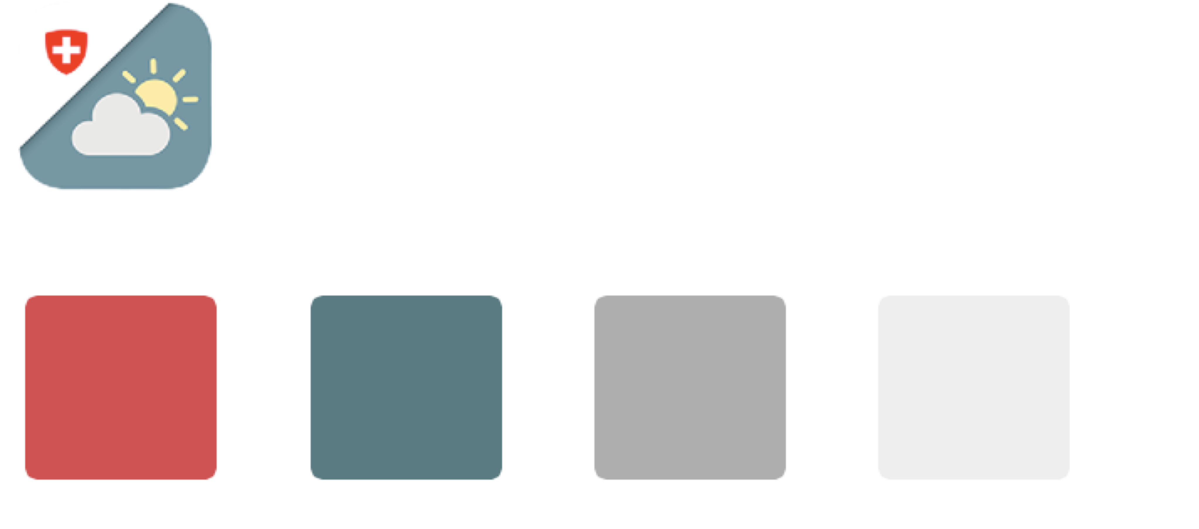
Work sans will be the only font used in the app.
![]()

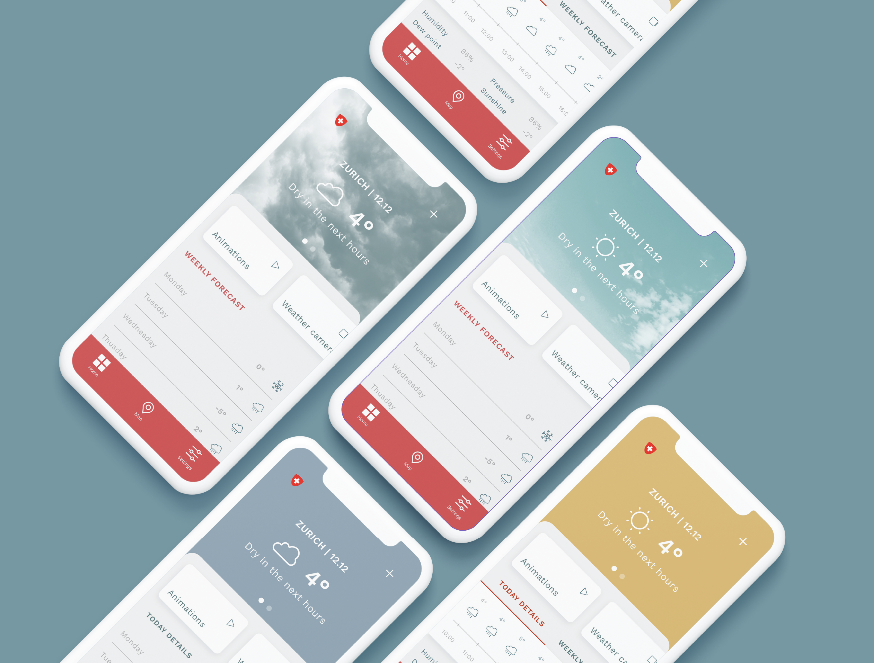
👩🏻🍳 FINAL DESIGN V1

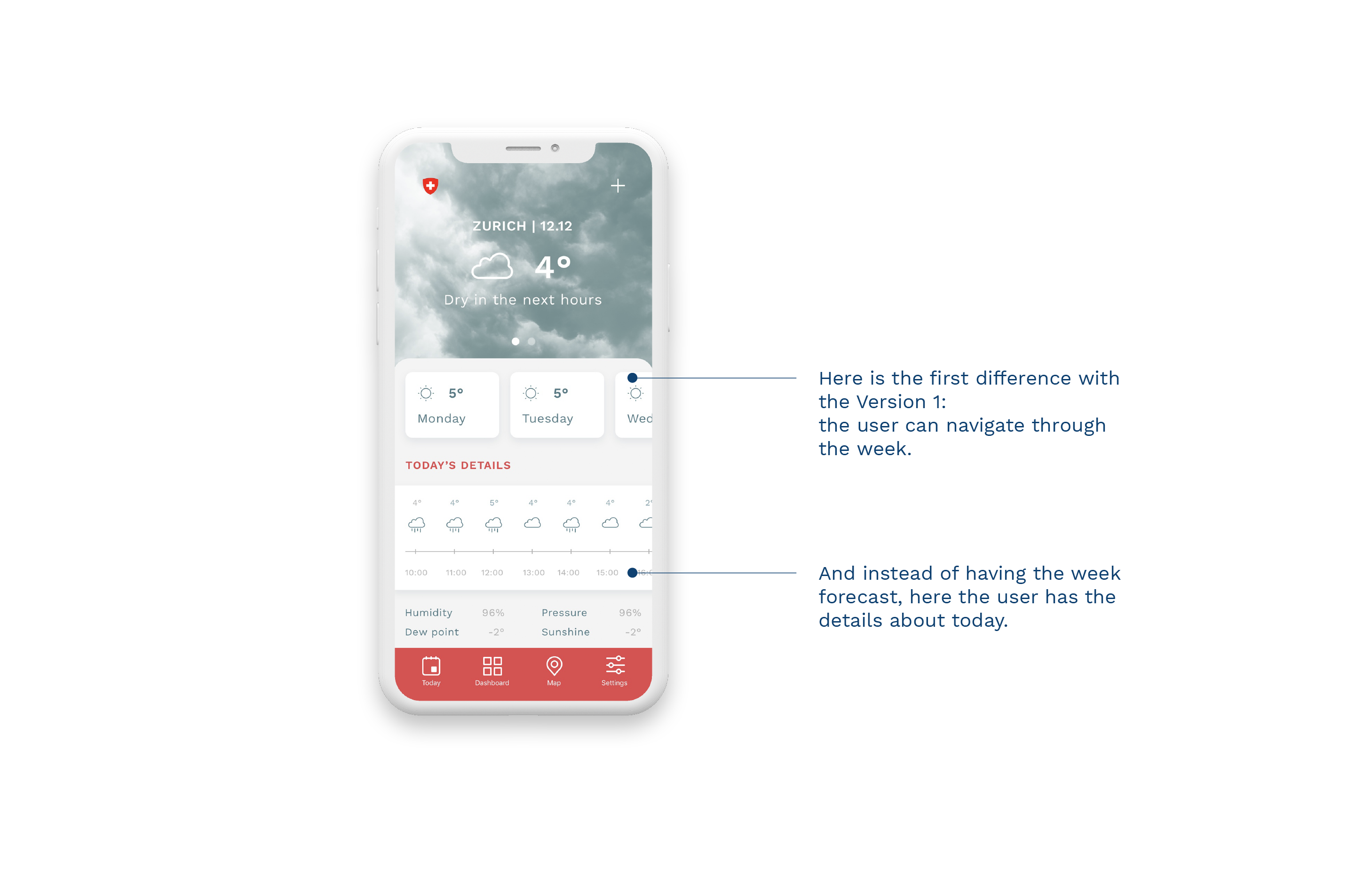
👩🏻🍳 FINAL DESIGN V2
The goal of this version is to let users know more about today. Throught the tab bar they can still go to the dashboard where they will have the animations, the measurements...etc.
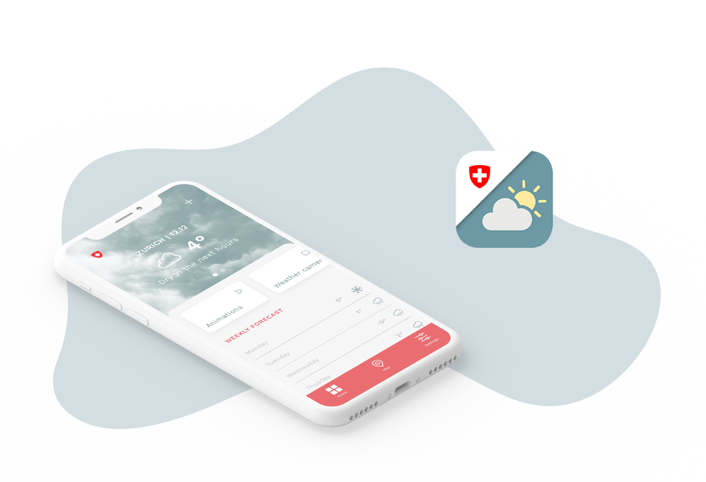
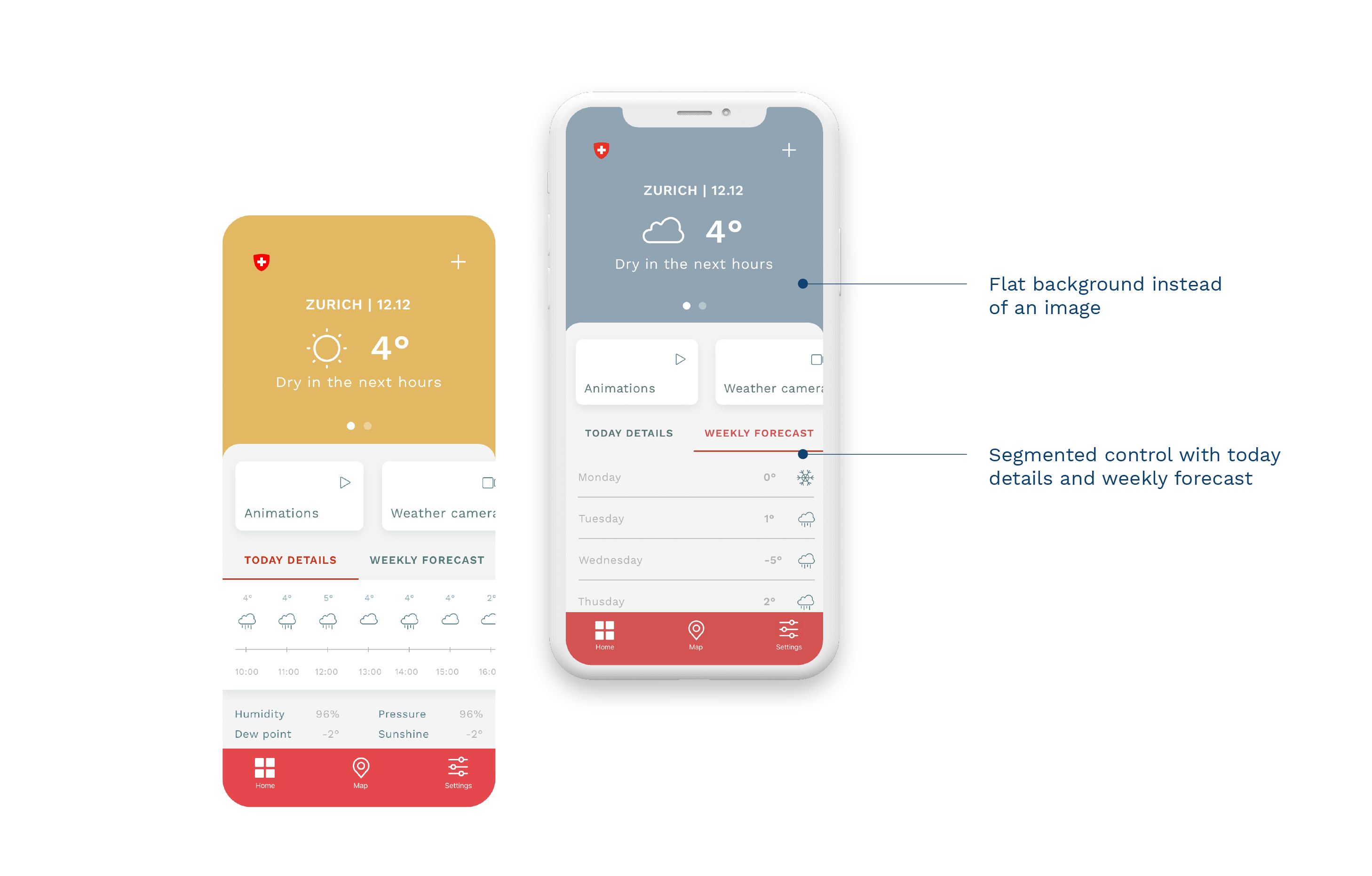
👩🏻🍳 FINAL DESIGN V3
Same as the two versions above but here the main background is a flat color: maybe less engaging and less clear at a first glance but perhaps easier to be implemented.
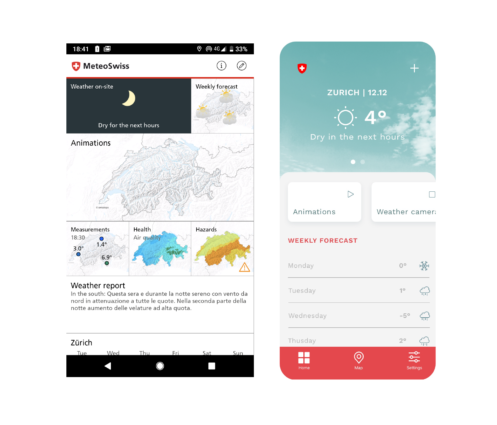
👩🏻🍳 COMPARISON WITH THE CURRENT VERSION
I tried to make the UI more clean and clear, less cluttered and only with relevant information (just remember that this project was done in 4h for an interview :) )
I tried to make the UI more clean and clear, less cluttered and only with relevant information (just remember that this project was done in 4h for an interview :) )